After completing Exercise 1 and 2 for this lesson, you should have a basic understanding of HTML and CSS. This assignment will provide further experience designing with code and managing web assets.
Objectives
- Adapt a prepared design to a functioning HTML project.
- Create an engaging design based around a specific concept and passage of text.
- Implement custom fonts to create a unique typographic composition.
- Understand the structure of an HTML/CSS proejct and practice good file management.
Get the Template Files
Download the sample HTML project from this GitHub repository.
- Click the green "Clone or Download" button.
- Choose "Download Zip"
- Unzip the file on your computer by double-clicking.
- Copy the contents of the "landing-page" folder to your local-directory folder.
The sample project includes one HTML file called "index.html" and a folder called "css" that contains "styles.css" and "grid.css"
CSS properties can be included in the <head> section of a single html page, but it's common practice to place all the CSS in a separate file to keep things organized. For this template the properties governing the grid structure are placed in "grid.css"—which you shouldn't edit unless you are confident in your ability to create a new grid structure.
Place your custom CSS for fonts, colors, etc. in "styles.css"
Open the HTML file in a web browser and in Brackets, to examine the structure of the website and how it is defined in the code.
There are extensive comments to help you find your way around (comments will appear grey in Brackets)
The layout uses modern HTML5 declarations like
<header>and a responsive Flexbox layout in an effort to teach current standards.
12 Column Grid
Each section in the grid is made up of a column within a row. Try resizing the browser to see how the columns stretch to fit the size of your window.
If you use the classes "row" and "column", each column will occupy equal widths to fit within the row: one column would be 12 sections wide, 2 columns would be 6 sections wide, 3 columns would be 4 sections wide, etc.
<div class="row">
       <div class="column">
         <p> Some content </p>
       </div>
</div>
If you want more control over the size of your columns, you can add the classes "one-half", "one-third", "two-thirds", or "one-quarter" to create columns with varied widths. You must also include the class "column" as is done in the examples. Make sure that your specified columns add up "one" (in other words, don't put a "one-half" and "two-thirds" in the same column or things will get weird.
<div class="row">
       <div class="column one-half">
         <h2>Some content</h2>
       </div>
       <div class="column one-quarter">
         <h2>Some content</h2>
       </div>
       <div class="column one-quarter">
         <h2>Some content</h2>
       </div>
</div>
The height of any section can be defined in CSS with the height property.
Guiding Thoughts
- Feel free to delete all of the rows and columns in the HTML template and create your own arrangement.
- Change the background color of the columns and the body in "styles.css"
- Some CSS properties are included in "styles.css" with comments to get you started.
- Check the CSS Crash Course page for other CSS properties to play with.
- Try to accurately recreate your Illustrator mockup, but if you find ways to improve your design or limitations of the CSS grid structure, then you can adapt your design as needed. Just keep the same visual style and concept.
Fun CSS to play with:
- SVG Patterns — copy and paste some code for awesome patterns!
- More SVG patterns
- CSSmatic — a web tool to help create CSS gradients, rounded corners, drop shadows, and noise textures.
- Text Shadow generator — Another web tool for drop shadows on text.
Using Brackets
You should use Brackets to edit the template files; just select Filer >>> Open folder
Brackets has several features that will make your job easier. It automatically color-codes different properties to help you understand the code, and it offers prompts as you begin typing. For example, if I type <div> in an HTML file, it will automatically generate the closing </div> tag. Or if I type the letter "b" in a CSS file, it will suggest a variety of properties starting with that letter.
You should also try out the Live Preview mode by pressing the Lighting Bolt icon in the upper-right of the Brackets window. This opens a special web browser that shows a live preview of your files; it even changes dynamically as you edit the HTML or CSS. If you click on an HTML tag or a CSS selector the targeted area will be highlighted in the Live Preview browser, similar to how the web inspector works in Chrome.
Finishing Up
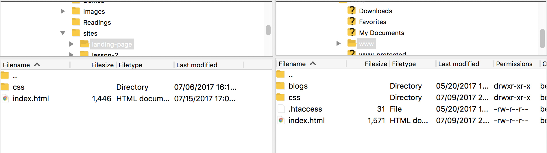
When you're finished, use Filezilla to upload the files to the "www" section of your remote directory. You'll replace the existing index.html file with the one you just created; make sure to upload the css folder and it's contents to the same place.
[INSERT SUBMISSION LINK]