A web designer's job includes more than making the content look pretty. It also has to be organized in a way that helps the user navigate the website, and one of the most universal ways of organizing information for visual display is in a grid.
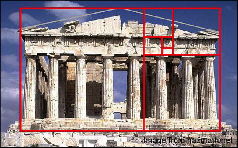
Grids provide a sense of order—in architecture, and design. Many aspects of web design originated in the world of print, where paper and printing presses necessitated rectangular formats. When designing for the screen, we're still working in rectangles, so grids are still a reliable way to structure information. One of the biggest influences in web design has been the look of newspapers.
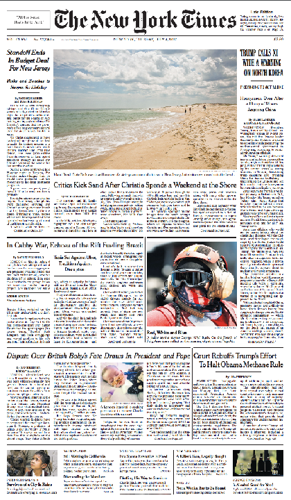
The text and images on the front page of the New York Times are divided into rows and columns. Depending on the size of the images and titles, the grid appears differently, but each page in the newspaper relies on the same underlying grid "skeleton." Newspapers have a very distinct layout, due to the narrow line-width of each column of text. Compare that to this image of the NYT website with a grid overlay:
 The pink overlay highlights the grid structure of the website. There are 11 columns, with some content spanning two or four columns, while some content is only a single column wide. This is a fairly complex layout, presenting a lot of information, so depending on your content, you might have significantly fewer sections in your grid. But even with two or three columns, designers can still create a lot of variety within a constrained framework.
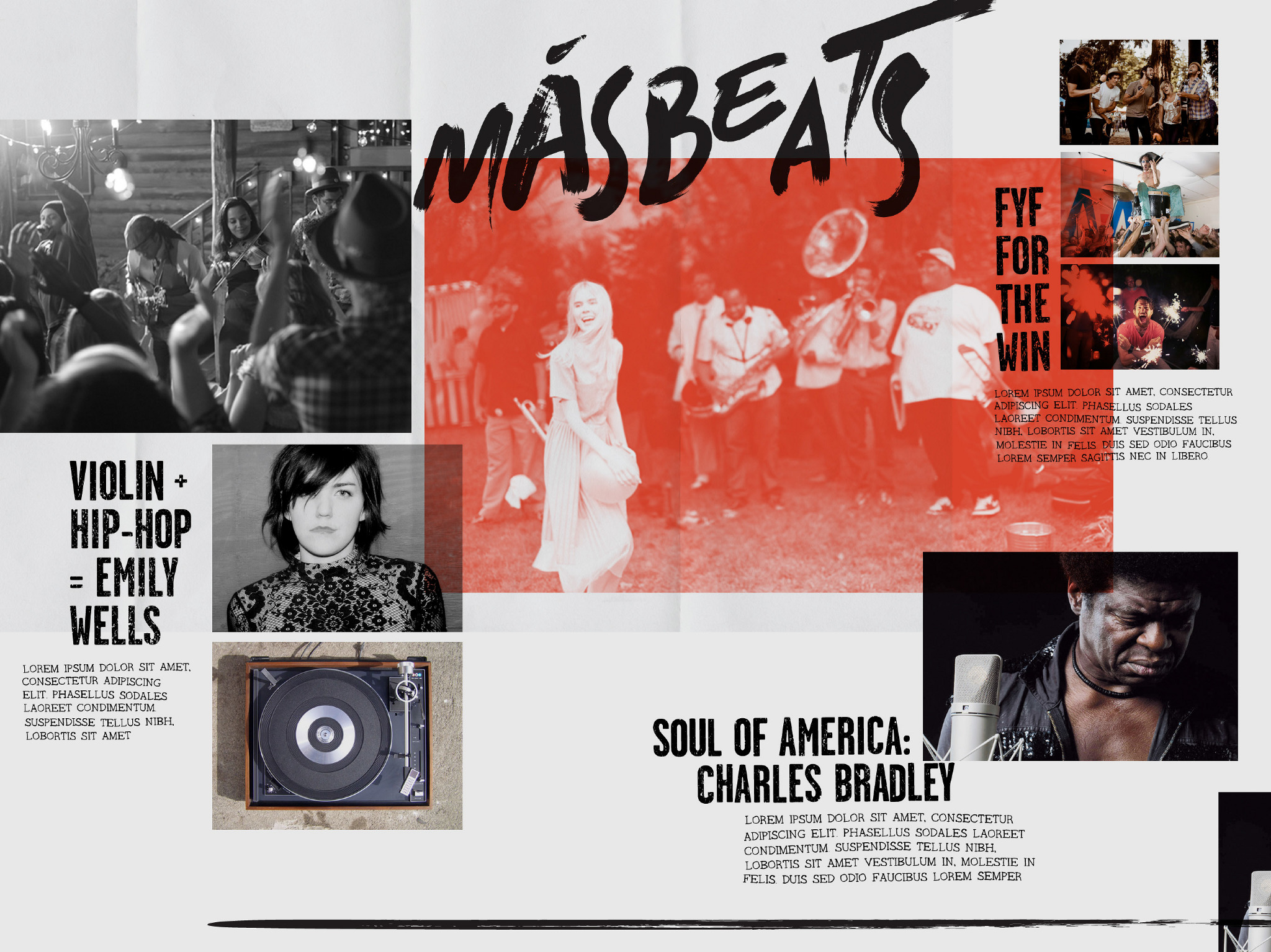
 In magazine layouts with big images and lots of white space, you might not be as aware of the grid structure, but it's still there, providing a unified reading experience from page-to-page. Also note that these examples all have margins—empty space around the edge of the page. In print design, any content near the edges might be obscured by the reader's thumbs, but providing space around the edges also helps the content feel less tightly packed. Larger margins also make content feel more treasured and important; consider the huge amount of white space in this book design:

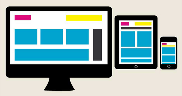
Grids are also popular for web design, because websites need to shift their layout to fit all different sizes of screens. You may notice some websites display content in a row on a desktop computer, but compress the same grid to a single column when viewed on a phone.
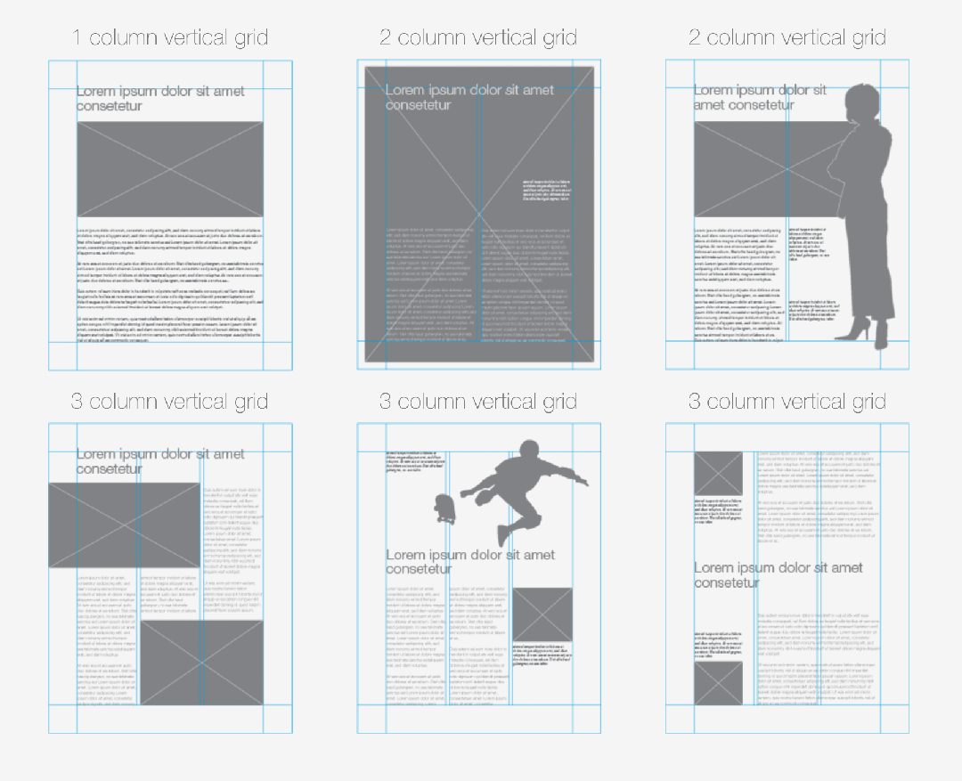
The most common arrangement you'll encounter is a 12-column grid, because it can be easily split into 2 sections of 6, 3 sections of 4, 4 sections of 3, and their various permutations. But advanced layout schemes can allow for grids of any number of sections, including nested grids—or grids within grids... Yeesh.
Also remember that because grids create order, they can easily become boring. Like all design "rules," grids should be thought of a tool, to be used or ignored as you see fit. Breaking the grid can be an exciting way to add some energy to a design, so consider ways to combine grids and more organic design:
- Overlapping
- Rotation, slanted text, etc.
- Cropping; extending elements off the page or screen
- Irregular handwriting or drawings
- Circles
- ???
 This is a design by Rich Scurry for Taco Bell—in which he conjures a rebellious look for the food chain with an irregular, overlapping layout and slanted text (even the body text is subtly distorted).