Unit 1 included an introduction to creative typography, but as we continue to work with text, we need to think about typography as a functional tool as well as an aesthetic object. Because many websites contain long passages of text, it will be helpful to look at some of the traditional rules of typography.
Required Reading: Butterick's Practical Typography
Read the excerpts from Butterick's Practical Typgraphy before continuing, and feel free to check out the rest of the website for more tips on using type.
...
Like any design "rules," these guidelines about typography should be remembered as traditions, and not fixed rules. If you think breaking some of these guidelines will improve your design, feel free!
The benefits of these rules are that they are what people are used to seeing in professional design. By utilizing separate styles for header text and body text, a reader can quickly identify the important information and more quickly skim the content. As you know from HTML, you can have up to six header styles, which create a visual hierarchy of organization; in other words, they help readers identify where sections of content begin and end. Headers also help search engine optimization (SEO) because ranking algorithms like Google's use headers to identify the main subjects of a website.
Font Pairing
Web designers typically create this distinction of header and body text by using different fonts for headers and body text. Font Pairing is the art of choosing two fonts that look good together. You can use more than two fonts if it seems useful, but if you have more than 3-4 your design will appear unorganized and chaotic.
Let's look at the main three families of fonts: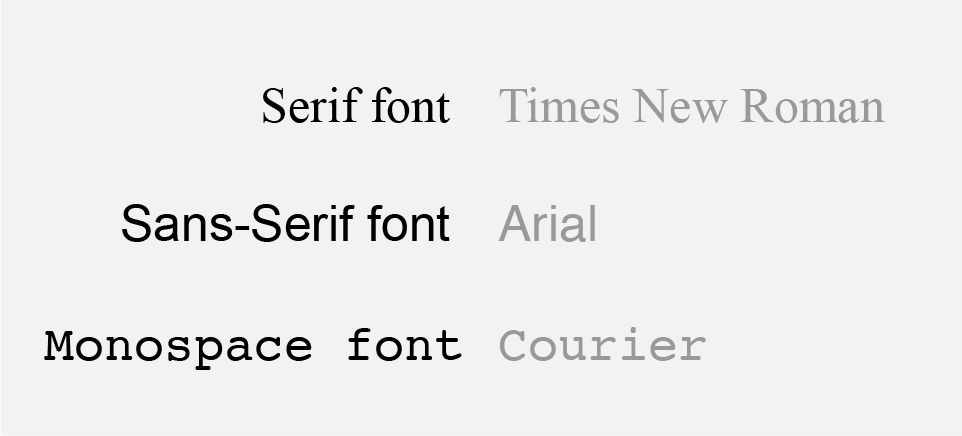
Serifs are the small "feet" included at the top and bottom of individual characters; they are designed to help guide a reader's eye along a line of text; for this reason they are more commonly used for body text. As an example, consider almost every printed book you've ever read. Serif fonts generally make text feel more traditional and old-fashioned.
Sans-serif fonts (literally "without serifs") appear more modern and are typically used as headers.
Monospace fonts derive from typewriters—where each character had to be the same width—and are mostly used in coding environments like Terminal or Brackets. Traditionally you wouldn't use these fonts for body text, but many designers will sacrifice readability for a typewriter or computer-y aesthetic.
When beginning a project, it's helpful to choose two fonts as a basis for your headers and body text. You can always add additional fonts if needed, but see what you can do just by varying the size and color of your two starting fonts.
You can use any combination of serif and sans-serif fonts! Don't feel limited by the tradition of sans-serif headers and serif body text.
Ian Yates' A Beginner's Guide to Font Pairing is a great crash course in the issue. To highlight one idea from his article, consider whether your fonts are concordant (i.e. similar) or contrasting (i.e. different). Fancy type vocabulary... yeesh.

The fonts on the left are "Droid Serif" and "Droid Sans," which were designed to be used as a pair and are very similar.
The fonts on the right are "Bebas Neue" (a condensed—i.e. tall and narrow— sans-serif font) and "Alex Brush" (a handwriting font), and are visaully very different. This combination has a lot more energy, because of the dramatic contrast between the fonts, but such a pairing might not be appropriate for some types of content (say, a hospital).
Both concordant and contrasting font pairings can work successfully. One unexpected danger that Yates warns about is fonts that are so similar that they become confusing to tell apart. In the end you just have to use you judgement, and go with what looks good!
Here are some more resources for pairing fonts:
- Font Pair — highlights suggested pairings from Google fonts
- 2017 Trendy Google Font Combinations — a gorgeous site that is worth looking at just to appreciate its use of type as composition.
- FontJoy — Randomly pairs Google fonts based on machine learning. Does the algorithm make good design choices?
- Google Font Pairing + Fine Art — A curated list of font pairs that adds a third element... background images!
- Our Own Thing: Google Font Preview — Quickly preview any combination of Google Fonts without having to download and install them.
Font Libraries
We've talked about Google Fonts already, and as you can see from the links above, that's a very popular library of fonts. But since our upcoming projects won't be relying on hand-coding HTML, we can more easily implement fonts from other sources.
Google Fonts is still great, and provides a well-curated selection. You can even view suggested font pairings if you select a font and view it's information page.
Adobe Typekit is a font library included with your subscription to the Adobe Creative Cloud. You can browse available fonts from the website or by clicking on the "Typekit" button within most Adobe apps (usually located in the Character window). You can download the fonts for use on your local computer, and set up a "kit" of custom fonts to include in web projects. I've found this to be more difficult to set up than Google Fonts because you have to specify which domains (i.e. URL's) you want to use the fonts on. For more detail on how to use these fonts, check out Lynda's course Typekit Quick Start.
Free Libraries: For use on websites, it's best to use font libraries designed for the web, but you can try using fonts from elsewhere too. There are many sites where you can fid free fonts, such as DaFont and 1001 Free Fonts, but my favorite is Font Squirrel—they have a well curated selection that isn't overwhelming and they make it easy to package fonts for use in websites.
Paid Libraries: Beyond these selections of free fonts, you can find many fonts that cost money. These are typically designed with more care, and come with more options of weights, filetypes, etc. Fonts can be ridiculously expensive, but if you may find yourself working on a project where the perfect font just isn't available for free. One site I've used on those occasions is My Fonts, or you can check out FontShop.
Arranging Type
Beyond choosing the right fonts, there are some other details that will affect the readability and design of your websites. Butterick's Practical Typography does a great job explaining line length, which is an essential consideration for responsive design. If the width of a browser window can stretch from 600px to 1920px, that means a line of text could be obnoxiously short or exhaustingly long. The ideal line length (about 60 characters) lets helps users comfortably scan horizontally without getting lost.
Line spacing — or line-height in CSS — also helps long passages of text feel spacious and inviting to read. As suggested in Butterick's Practical Typography, the default line spacing is often too cramped. This can also be important when designing headers, navigation menus, and other pieces of standalone text.
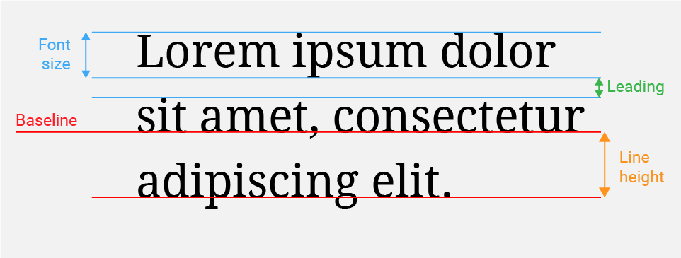 Some of these terms are more commonly used in print design, but this diagram may help you envision the underlying structure of a line of text.
You're probably already familiar with alignment (left, right, or center) from using Microsoft Word and the like. Body text should almost always be left-aligned because that's how people are used to reading. Center alignment is often used for headers or menus, and right-alignment is typically reserved only for unique compositions where the text is placed in context to some element on the right. The lesser-known alignment options is justified text, which adds space between words to arrange text blocks exactly with their bounding containers. This is how text appears in newspapers, and can be useful if you want to stress the rectangular shape of body text.