Color is one of the most familiar elements of design, and while most people are familiar with mixing paints and choosing a colors for their living rooms, it's takes a lot of work to develop a robust color sense. Good designers choose colors that communicated complex associations and work in a variety of different contexts. As web designers, our job is somewhat simpler, because we're only concerned with using colors on screens—so let's take a quick look at how screens and computers deal with color.
Humans perceive only a small section of of the light emitted by the sun, but if you've ever used a prism, you've observed how that light can be split into a rainbow of colors. Our eyes contain specialized cells—called cones—that are sensitive to specific wavelengths of light, which we perceive as different colors.
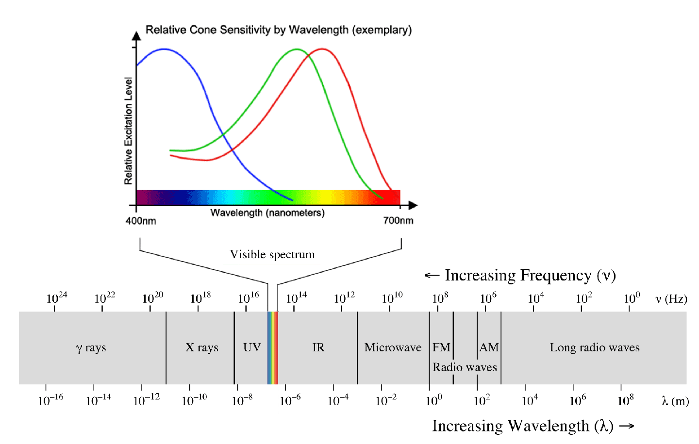
Our eyes detect light primarily in terms of red, green, and blue (a different type of cell is responsible for detecting light-dark values) which our brains combine those colors to create millions of unique colors, and this is the same principle used by computer screens and televisions to emit light. In those cases, the process works backwards, starting with red, green, and blue (RGB) signals and using them to construct a final picture through emitted light. Here's an highly magnified image of a computer screen (and a fun video), revealing individual pixels:
![]()
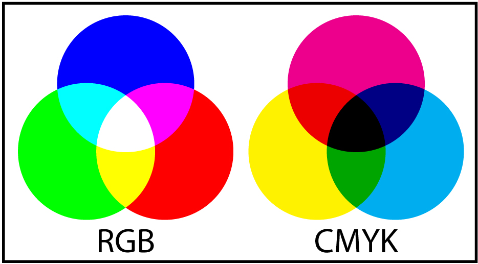
Each pixel is actually made of three lights (red, green, and blue), and in this image you can see how other colors can be created by color mixing. Red and blue make magenta... blue and green make cyan... and red and green make YELLOW!?
Light does not follow the rules of color mixing you learned in painting class. In fact, there are two types of color mixing:
- Additive (RGB): Red, green, and blue combine to produce the full light spectrum; used in screen and digital cameras.
- Subtractive (CMYK): Cyan, magenta, yellow, and black combine to subtract (i.e. absorb) from the full light spectrum; used in inkjet printing, film photography, and printmaking.
If that's how our devices understand color, then how do we instruct them to produce the colors we want? Mostly, by providing a number value for each of those RGB pixels.
Early web browsers like Mosaic and Netscape Navigator only supported 140 colors, which were identified by names like "orange" and "BlanchedAlmond." Those names are still accepted in modern CSS, and I tend to use them when experimenting with layouts when I just need some quick color choices.
Hex-codes (a.k.a. Hex Triplets)
As screens and browsers grew more powerful, it became common for colors to be represented as six-digit hex-codes like #D4E7AB. This syntax is still used by many developers and applications. The six characters represent values for red, green, and blue, with each color accepting a value of 00 to FF (see below). This works out to 256 possible values per color for a total of 16.7 million colors.

RGB/RGBA
This is another way of representing colors, that is a little more logical. You will frequently see colors represented in applications as RGB values from 0–255. You can represent colors with the syntax rgb (255, 255, 255); in CSS but the better option is RGBA. The A stands for "alpha" which is a digital term for transparency. That means that you can set the color of an element to be transparent!
Like opacity, you do this with a value from 0–1. So the syntax is rgba (255, 255, 255, 1.0); for pure white or rgba(186, 128, 216, 0.5); for a 50% transparent lavender.
HSL/HSB
The problem with the previous methods of color naming is that they are difficult to remember, (unlike "BlanchedAlmond") and don't directly relate to the way humans think about color. A newer way of naming colors in CSS and other design contexts is Hue, Saturation, Lightness (sometimes labeled Brightness) or HSL (or HSB). The CSS is similar to RGBA in that each value receives a number, but these terms are much more familiar and useful for designers. HSL allows designers to look at a design and say: "That blue needs to be more saturated!"—which is difficult to do with hexcodes. This is big deal for designers, and helps achieve more natural easily adjusted colors.
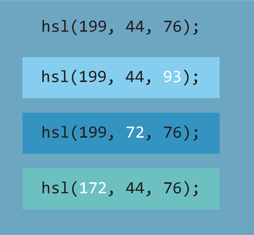
The syntax is hsl(360, 100, 100); with hue accepting 0–360, and saturation and brightness accepting 0–100.
You can also add alpha to control transparency: hsla(360, 100, 100, 1.0);
Color Value
One of the easiest ways to start improving your use of color, is to remember that every color has value. Value describes the brightness or light-dark relationships of the color. If you convert a photo to grayscale, you'll see which colors are brighter or darker. To make sure that your content is legible, keep value in mind when choosing your colors.

In this example, both passages of text are blue, but even though blue seems like a very different color from the red used in the background, the bottom passage is a very similar value—so it's nearly impossible to read. Look at the top passage of text... is it a lighter or darker value than the background?
This is important beyond text legibility, if you have two different colored sections of a website, consider that a contrast in value will make them stand apart more and increase the feeling separation between content. This sense of contrast is usually what people mean when they say that colors "pop."
Color Palettes
So, that's how to define and use specific colors, but the real art of web design happens when you start combining colors. Colors are like musical notes, in that they immediately create relationships with other colors. As a designer, it's you job to compose a set of colors that makes the content legible, communicates specific moods and styles, and works in a variety of contexts.
Most sites use a color palette—or limited set of colors—throughout the site. This is common practice among graphic designers and software developers too. The specific colors work with typography and graphics to create the brand of website or company. The red, green, yellow, and blue used in the Google logo are used throughout their app ecosystem and are instantly recognizable as a part of their branding (i.e. consistent visual or thematic design used to control the perception of a company or project).

There are a variety of tools for developing color palettes, for this class we'll focus on Adobe Color, because it integrates with the Adobe Creative Suite. Watch some of the videos from Lynda's course on Adobe Color or just go play with the website.
Optional Lynda Tutorial: Adobe Color
The graphical user interface (GUI) lets you click and drag to pick colors, which are represented as hex-codes, RGB values, and HSL (though Adobe calls is HSB). There are some different options to generate a color palette from a single color, and if you sign in with your Adobe account, you can save color palette for use in Creative Cloud applications.
Some other tools to try:
Coolor — A simple color picker that randomly generates color palettes. I like the big, simple interface.
Color Mind — Another app that generates color palettes; this one uses a machine-learning algorithm that analyzes thousands of real-world websites. But does it do a better job than a human designer? Also provides a handy preview of the color palette in use on a generic web layout.
Palettetron — A color picker with a real nitty-gritty interface, mostly based around a single starting color.
Palette Generator — Generates palette based on image uploads.
All of these tools can help you brainstorm, but they are not a replacement for a human designer. Your color choices should always be selected according to the project at hand. What colors are necessitated by the design? What additional colors will help establish the proper mood or associations?
Most of these tools are based around a palette of five colors—this is a good number to work with, but is not a requirement. Sometimes simpler is better, and a good site can work with just two or three colors. Or you might be working around a logo with a rainbow in it and incorporate 8 or more colors. Consider the functionality of your site; if users are completing a submission form, you probably want a success and failure message, which means you might include green (success!) and red (failure!) even if those colors don't appear in your main palette.
Some guiding principles:
- Choose a main brand color to focus your design around.
- Include a light color (white-ish) and a dark color (black-ish).
- Additional colors are usually most effective used as occasional accent colors.
- Choose colors that provide a variety of combinations (e.g. light text on dark, dark text on light, can the main brand color used as a background?)
- Consider associations of your colors (e.g. a website for a gardening club should probably involve green and/or brown).
The Color Mind site does a nice job explaining the functions of a standard web palette (i.e. brand color, light, dark, accent), but there's one more rule:
- Break the rules.
If every designer followed the same formulas, the world would be a boring place. Look at the way color is used in your favorite websites, magazines, and movies—or go take a walk outside to look for inspiration.
When developing a website or brand, I usually start with an Illustrator file and create a bunch of squares with different colors (often using the tools above to choose some of the colors), and move them around to see how they work together. At this stage I'm also choosing fonts, so I'll put header and body text on top of color squares to see how it all looks together—adjusting the colors as needed until it looks good. After all, there's no right answers for color choices, it's all about using your own taste and experience.