Throughout this course we will use Illustrator to outline and develop our websites. This is common practice among design firms and freelancers, so let's get the terminology straight before we begin.
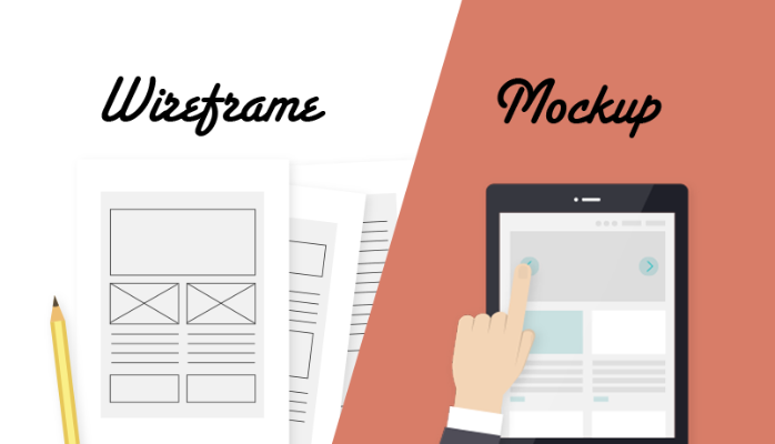
Wireframes
Wireframes are the most basic version of a layout. After creating a mood board for inspiration, this is where you start pull your idea out the ether and make it real. At this stage your design will have no color or custom fonts, and the exact dimensions of content sections will probably change later on down the road.
The goal here is to figure out how the content will be arranged, and roughly how much space the elements will occupy in you design. You should think about how a user will interact with the site, what is the most important thing for them to see first? What might be confusing? How can be create an engaging narrative as users travel one one section of the site to another?
Wireframes can even be done in a sketchbook, but we'll use Illustrator to keep everything neat and legible. Digital design also allow you to easily resize and rearrange elements.
Mockups
Taking the wireframe to the next level, mockups adds colors, fonts, and graphics to create a lifelike replica of the final website. It's good to get dimensions and sizing as close as possible to the final product, but certainly you want a 2D image that you can show to people to convey what the final site will look like. If you're working with a separate web developer, this might be as far as the designer goes in the process, as they hand of their mockup as a reference image.
Prototypes
Both wireframes and mockups can be made into interactive prototypes, where you can actually click on things to simulate the final user experience. We'll talk more about prototypes in Unit 3—for now, we will be making static 2D graphics in Illustrator.
Lynda Course: Illustrator for Web Design: Wireframing
Exercise 2: Narrative Wireframe
Objectives
- Compose the basic layout of a one-page website using 2D design software.
- Prepare text and image assets for use in the final design.
- Consider user experience and responsive design from the first stages of design.
For this exercise, students will create a 2D wireframe of their one-page narrative website. Refer to the project overview on a previous page for the requirements of the final website.
Requirements
Your finished wireframe should consist of two images:
- A mobile layout (640px wide)
- A desktop layout (1280px wide)
Colors: The wireframes should use a limited color palette—either black/white/gray, or simple colors to delineate content sections.
Text: You do not have to use the final text for the website at this point. It will be helpful to use descriptive headers and labels to make it clear how the site is organized, but for body text, you may use filler text as a placeholder. The traditional text is a latin passage from The Extremes of Good and Evil by Cicero (45 BCE), known as Lorem Ipsum—get the text here.
There are also a bevy of contemporary spins on Lorem Ipsum, such as Hipster Ipsum, Corporate Ipsum, Sagan Ipsum, and Online Dating Ipsum. Browse them all at Meet the Ipsums and find something appropriate for your project.
Images: You can put simple rectangles as placeholders.
Workflow
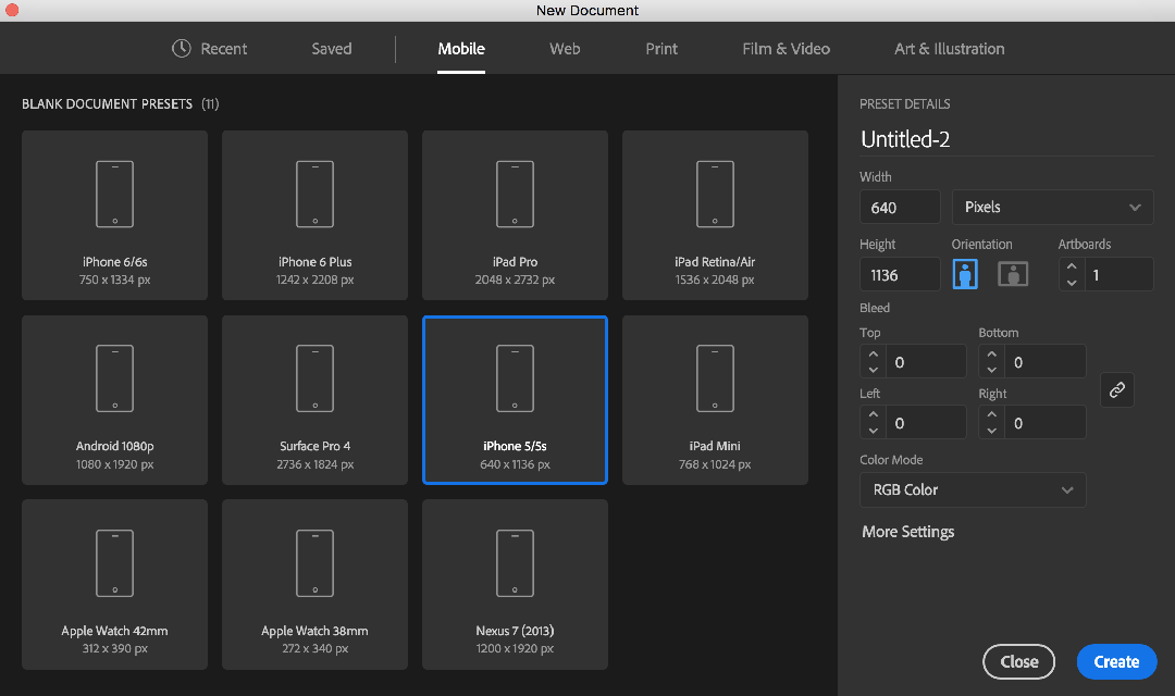
Step 1: Create a document
When creating a new Illustrator document, choose the preset Mobile >>> iPhone 5/5s (640px x 1136px).
Newer phones aren't quite that small, but it's good to design around the smallest size you might encounter.
Step 2: Set up artboards
Create a second artboard by following the instruction in the Lynda video Using Artboards for Responsive Design. We're not going to bother with a tablet layout for this assignment, so you should only have two artboards. Make your second artboard 1280px x 2000px as seen in the video, and then change the height of your artboards as needed for your project. You will probably need to increase the height of the artboards to fit your content—this will simulate the entire content as if you could see it all at once without scrolling. Select the Artboard tool and drag the bottom edge of an artboard to expand the height.
Step 3: Wireframe Design
While making your wireframes, you will mostly be using the Rectangle tool (M) and Type tool (T). Use the Pen tool (P) to make straight or curved lines.
Start with your mobile layout, as working with the limited real estate of a mobile design forces you to identify the most essential parts of your design. As you work, you can copy and paste content from the mobile layout to the desktop layout and adjust as needed.
To select multiple objects, either drag a large selection with the Selection tool (V) or hold Shidt to add to your current selection.
Step 4: Exporting
The advantage of working with multiple artboards is that you can easily export each one as a separate file.
Once you're finished with both layouts, choose File >>> Export >>> Export for Screens.
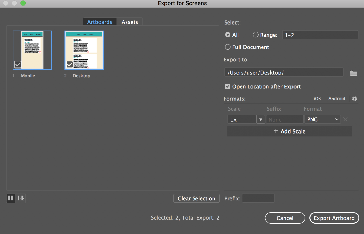
Make sure you have both artboards selected on the left of this window, then choose a location for the "Export to" field. Set the format to PNG and the Scale to 1x.